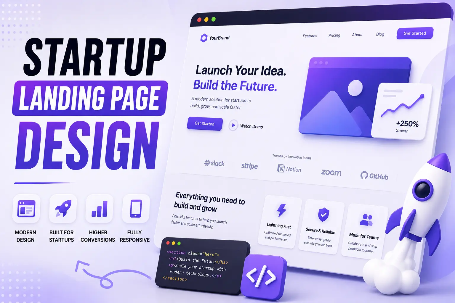
Imagine you've spent months building an incredible product. Your team is excited. You've polished the features, fixed the bugs, and finally launched. Then you run your first marketing campaign. People click your ads. Visitors arrive on your website. …and almost all of them leave without signing up.
This is one of the most common challenges startups face. In many cases, the problem isn't the product, it's the landing page.
A landing page is often the first real interaction someone has with your business. Within a few seconds, visitors decide whether they understand your value, trust your brand, and want to take the next step.
That's why great startup landing pages aren't designed just to look modern. They're designed to communicate clearly, reduce friction, and guide people toward action.
At Pixiio, we believe a landing page should work like your best salesperson: explaining your offer, answering objections, and making it easy for visitors to say "yes."
In this guide, you'll learn what makes a startup landing page successful, the mistakes that reduce conversions, and the practical framework you can use to build pages that support sustainable business growth.
Why Startup Landing Pages Matter
Unlike established brands, startups don't have years of reputation or widespread customer trust. Your landing page has to do several jobs at once:
- Explain what you do
- Show why it matters
- Build credibility
- Answer common objections
- Encourage visitors to take action
If any of these elements are missing, people are likely to leave, even if your product is excellent. Think of your landing page as a conversation with a potential customer. Every section should answer the next question they're likely to have.
Common Reasons Startup Landing Pages Fail
Many startups assume that adding more animations, gradients, or trendy visuals will increase conversions. In reality, the opposite is often true. Here are a few common issues:
Unclear Value Proposition
Visitors shouldn't have to guess what your product does. Within the first few seconds, they should understand:
- Who it's for
- What problem it solves
- Why it's different
- What they should do next
A simple, customer-focused headline often outperforms a clever but vague slogan.
Talking About Features Instead of Outcomes
Founders naturally love talking about features. Customers care about results. Instead of saying, "AI-powered workflow automation platform," explain the benefit: "Automate repetitive work so your team can focus on growing the business." People buy outcomes, not feature lists.
Weak Calls to Action
A landing page should have one primary goal. Whether that's:
- Book a demo
- Start a free trial
- Request a quote
- Schedule a consultation
Make that action obvious throughout the page. Too many competing buttons create confusion and reduce conversions.
The Pixiio Landing Page Growth Framework™
When we evaluate a landing page, we don't start with colors or typography. We start with strategy. Our framework includes six key stages:
1. Understand the Audience
- Who are they?
- What problem are they trying to solve?
- What motivates them?
2. Clarify the Offer
Can visitors understand your value within a few seconds? If not, simplify the message.
3. Build Trust
Include:
- Testimonials
- Client logos
- Reviews
- Case studies
- Results
- Certifications
People are far more likely to take action when they see evidence that others have succeeded with your product or service.
4. Reduce Friction
Ask yourself:
- Is the form too long?
- Are there unnecessary steps?
- Can visitors complete the action in under a minute?
The easier the process, the higher the likelihood of conversion.
5. Guide the User
Every section should naturally lead to the next.
Avoid making visitors wonder: "What should I do now?"
Use clear visual hierarchy, concise copy, and consistent calls to action.
6. Measure and Improve
A landing page is never truly finished. Monitor:
- Conversion rate
- Bounce rate
- Scroll depth
- Form completion
- Heatmaps
- Session recordings
Use those insights to make continuous improvements rather than relying on assumptions.
The Anatomy of a High-Converting Startup Landing Page
Now that we've covered why landing pages matter, let's look at what actually makes one convert.
Many founders ask: "What sections should my landing page include?"
There's no universal template, but the highest-performing startup landing pages follow a similar structure because they're built around user psychology, not trends.
The Ideal Startup Landing Page Structure
A landing page should guide visitors from curiosity to confidence. Here's a proven structure:
- Hero Section
- Problem & Solution
- Social Proof
- Key Benefits
- Product or Service Overview
- How It Works
- Results or Case Studies
- FAQ
- Final Call-to-Action
Every section has one purpose: answer the next question your visitor is likely to ask.
1. Hero Section: Win the First 5 Seconds
Your hero section is the most important part of the page. Most visitors decide within a few seconds whether they'll continue reading. Your hero should answer four questions immediately:
- What do you offer?
- Who is it for?
- Why should someone care?
- What should they do next?
A Simple Formula
- Headline, State the biggest outcome.
- Subheadline, Explain how you deliver that outcome.
- Primary CTA, Guide visitors to one clear action.
- Supporting Visual, Show the product, service, or result, not just decorative graphics.
Example, Instead of: We Build Digital Experiences.
Write: Grow Your Startup With Landing Pages Designed to Convert More Visitors Into Customers. This is specific, benefit-driven, and immediately relevant to founders.
2. Focus on Benefits, Not Features
One of the biggest mistakes startups make is listing features without explaining why they matter.
| Feature | Benefit |
|---|---|
| Unlimited integrations. | Connect your existing tools without disrupting your team's workflow. |
| Lightning-fast website. | Keep visitors engaged and reduce drop-offs with faster loading times. |
People don't buy features. They buy the outcome those features create.
Whenever you write about your product or service, ask yourself: "So what?" If you can't answer that question, the message needs improvement.
3. Build Trust Before Asking for Commitment
Visitors rarely convert the first time they see a new brand. Trust must be earned. Strong trust signals include:
- Verified testimonials
- Client logos
- Case studies
- Industry awards
- Performance metrics
- Media mentions
- Certifications
- Founder story
Instead of saying: We create amazing websites. Show proof: Helped startups increase demo bookings by improving landing page clarity and user experience. Evidence always beats promises.
4. Keep Navigation Focused
A landing page is different from a traditional website. Too many navigation links can distract visitors from your primary goal. For campaign landing pages, consider:
- Minimal navigation
- One clear CTA
- Reduced distractions
- Clear content hierarchy
Every unnecessary click is another opportunity for visitors to leave.
Good vs. Poor Landing Page Practices
| Poor Landing Page | High-Converting Landing Page |
|---|---|
| Generic headline | Clear value proposition |
| Multiple competing CTAs | One primary CTA |
| Feature-heavy copy | Benefit-focused messaging |
| Long paragraphs | Easy-to-scan sections |
| Stock images | Authentic visuals or product screenshots |
| Weak trust signals | Testimonials, logos, case studies |
| Cluttered layout | Clean visual hierarchy |
| Slow loading | Optimized performance |
The goal isn't to make the page longer, it's to make every section more useful.
5. Design for Scanners, Not Readers
Most visitors don't read every word. They scan. That means your page should be easy to understand at a glance. Use:
- Clear headings
- Short paragraphs
- Bullet points
- White space
- Visual hierarchy
- Consistent spacing
- Highlighted key information
A page that's easy to scan is often easier to trust.
6. Answer Objections Before They Become Barriers
Every visitor has questions. Examples include:
- Is this worth the investment?
- How long will it take?
- Have they worked with businesses like mine?
- Will I get ongoing support?
- Can they understand my industry?
Great landing pages answer these questions before visitors need to ask. Consider including:
- FAQs
- Process overview
- Portfolio
- Testimonials
- Results
- Clear pricing guidance (where appropriate)
Reducing uncertainty increases confidence.
7. Optimize for Mobile First
Many founders review their landing pages on a desktop, but a significant share of visitors arrive on mobile devices. Review your page on different screen sizes and check:
- Is the headline readable?
- Are buttons easy to tap?
- Does the page load quickly?
- Is scrolling smooth?
- Are forms simple to complete?
A mobile-friendly experience isn't optional, it's expected.
8. Every Section Should Lead to Action
One mistake we frequently see is waiting until the bottom of the page to include a call-to-action. Instead, place relevant CTAs throughout the page. For example:
- After the hero section
- After explaining the benefits
- Following testimonials
- Near the FAQ
- At the end of the page
This allows visitors to take action whenever they're ready, rather than forcing them to scroll to the end.
Practical Optimization Tips
Before publishing your landing page, review the following:
- Is your headline focused on customer outcomes?
- Can visitors understand your offer within five seconds?
- Are your CTAs consistent?
- Does every section have a clear purpose?
- Have you removed unnecessary distractions?
- Is the page fast and mobile-friendly?
- Are trust signals visible throughout the page?
- Does the copy answer common customer questions?
If you can answer "yes" to these questions, you're already ahead of many startup websites.
Common Startup Landing Page Mistakes That Cost You Customers
Even startups with excellent products lose potential customers because of avoidable landing page mistakes. Here are the most common ones, and how to fix them.
1. Trying to Speak to Everyone
One of the biggest mistakes is creating a landing page that targets "everyone." The result? It resonates with no one.
Instead, define your ideal customer clearly. For example:
- SaaS founders
- Marketing agencies
- Small business owners
- WordPress product companies
When visitors feel like your page was written specifically for them, they're much more likely to engage.
2. Hiding the Value Proposition
If visitors have to scroll to understand what you offer, you've already lost many of them. Your headline should communicate:
- What you do
- Who it's for
- The primary benefit
Avoid clever slogans that require interpretation. Clarity almost always outperforms creativity.
3. Asking for Too Much Information
Long forms create friction. If your goal is to start a conversation, ask only for the information you genuinely need. For many startups, this is enough:
- Name
- Company
- Brief project details
You can collect additional information later in the sales process.
4. Ignoring Social Proof
People trust other customers more than marketing copy. Strengthen credibility with:
- Client testimonials
- Case studies
- Company logos
- Review ratings
- Measurable results
Instead of saying: "We're experts." Show evidence that demonstrates your expertise.
5. Launching Without Testing
A landing page should never be considered "finished."
Track key metrics such as:
- Conversion rate
- Scroll depth
- Bounce rate
- Form completion rate
- Time on page
Small, continuous improvements often outperform a complete redesign every few years.
Startup Landing Page Checklist
Before launching your landing page, review this checklist:
Strategy
- Clearly defined target audience
- One primary conversion goal
- Strong value proposition
- Competitive positioning
Copywriting
- Benefit-driven headline
- Clear supporting copy
- Customer-focused messaging
- Objection handling
- Consistent tone
Design
- Clean layout
- Strong visual hierarchy
- Responsive design
- Easy-to-read typography
- Professional imagery or product screenshots
Trust
- Testimonials
- Client logos
- Case studies
- FAQs
- Contact information
Conversion
- One primary CTA
- Short form
- Multiple CTA placements
- Minimal distractions
SEO
- Optimized title tag
- Meta description
- Structured headings
- Internal links
- Optimized images
- Fast loading speed
How to Measure Landing Page Success
A beautiful landing page means very little if it doesn't achieve business goals. Instead of focusing only on traffic, measure:
| Metric | Why It Matters |
|---|---|
| Conversion Rate | Indicates how effectively visitors become leads or customers |
| Bounce Rate | Shows whether visitors are finding your content relevant |
| Average Time on Page | Reflects engagement and content quality |
| Form Submission Rate | Measures the effectiveness of your CTA and forms |
| Demo or Consultation Requests | Connects landing page performance to business outcomes |
These metrics provide a clearer picture of whether your landing page is supporting growth.
Frequently Asked Questions
How long should a startup landing page be?
There is no fixed length. The ideal landing page includes enough information to answer visitor questions and build confidence without unnecessary content. For complex products or services, a longer page often performs better.
Should startups use templates?
Templates can be useful for validating an idea or launching quickly. As your business grows, a custom landing page tailored to your audience and goals usually delivers stronger branding and better conversion rates.
Is WordPress a good choice for startup landing pages?
Yes. WordPress offers flexibility, scalability, and strong SEO capabilities. Combined with Elementor or custom development, it can support everything from MVP launches to growing SaaS businesses.
What's the difference between a homepage and a landing page?
A homepage introduces your business and serves multiple audiences. A landing page is focused on a single campaign or offer and is designed to guide visitors toward one specific action.
When should a landing page be redesigned?
If you notice declining conversions, outdated messaging, poor mobile usability, slow loading times, or changes in your target audience, it's time to review and optimize your landing page.
Ready to Build a Landing Page That Converts?
At Pixiio, we help startups, SaaS companies, marketing agencies, and WordPress product businesses create landing pages that combine strategy, design, and performance. Our process focuses on:
- Understanding your audience
- Crafting clear messaging
- Designing intuitive user experiences
- Building fast, SEO-friendly pages
- Optimizing for conversions
Get a Free Landing Page Audit
If you're unsure whether your current landing page is helping, or hurting, your business, start with a free audit. We'll review your messaging and value proposition, user experience and visual hierarchy, conversion opportunities, mobile usability, SEO fundamentals, and page speed and performance. You'll receive practical recommendations that can help improve your landing page, whether you choose to work with us or implement the changes yourself.
A high-converting landing page isn't built by chance, it's built through strategy, testing, and continuous improvement.
Final Thoughts
Your landing page is more than a design asset, it's a critical part of your sales and marketing strategy. A successful landing page doesn't rely on flashy visuals or the latest design trends. It succeeds because it communicates clearly, builds trust, and makes it easy for visitors to take the next step.
Whether you're launching a new startup, promoting a SaaS product, or expanding your business, investing in a well-planned landing page can have a lasting impact on your growth.
Rather than asking, "Does it look modern?", ask: "Will this page help the right people become customers?"
That simple shift in perspective often leads to better decisions, and better results.
Pixiio Team
Design & Development Agency
Pixiio designs and builds high-converting websites for startups, SaaS companies, and local businesses worldwide.