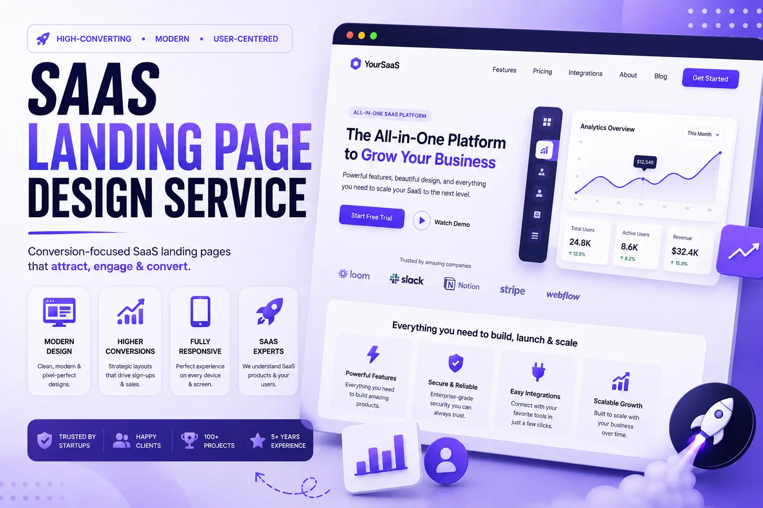
Building a SaaS product takes months, sometimes years. Your team spends countless hours developing features, fixing bugs, improving performance, and preparing for launch. Then you finally start driving traffic.
People click your ads. They visit your website. …and most of them leave within seconds. Not because your product is bad, but because your landing page fails to answer one simple question: "Why should I care?"
For SaaS companies, your landing page isn't just another marketing page. It's your salesperson, your product demo, and your first impression, and in many cases, it's the deciding factor between a visitor becoming a customer or leaving for a competitor.
At Pixiio, we believe successful SaaS landing pages aren't designed to impress designers. They're designed to help founders grow their businesses by increasing demo bookings, free trial signups, and qualified leads. This guide explains what makes a SaaS landing page effective, the mistakes that reduce conversions, and how to choose a design partner that understands both user experience and business strategy.
What Is a SaaS Landing Page?
A SaaS landing page is a focused marketing page designed to encourage visitors to complete one specific action. That action might be:
- Start a Free Trial
- Book a Demo
- Request a Consultation
- Join a Waitlist
- Download a Resource
- Schedule a Sales Call
Unlike a homepage, a landing page removes distractions and guides visitors toward a single conversion goal. Every section exists for one reason: to move the visitor one step closer to becoming a customer.
Why Landing Pages Matter More for SaaS Companies
Selling software is different from selling physical products. Potential customers often have questions before they're ready to buy, for example:
- What problem does this solve?
- Is it better than my current solution?
- Is it difficult to implement?
- Can my team learn it quickly?
- Is the pricing worth it?
- Can I trust this company?
A great SaaS landing page answers these questions before the visitor needs to ask. That's why successful SaaS companies invest heavily in messaging, UX, and conversion optimization, not just visual design.
Signs Your SaaS Landing Page Needs Improvement
Even if you're getting traffic, your landing page might still be underperforming. Common warning signs include:
Low Demo Bookings
Visitors explore the page but don't request a demo. This often indicates unclear messaging or weak calls-to-action.
Low Free Trial Signups
If users aren't starting your free trial, ask yourself:
- Is the value proposition obvious?
- Does the page build trust?
- Is the signup process too complicated?
Small UX improvements can make a significant difference.
High Bounce Rate
If visitors leave within a few seconds, the problem usually isn't traffic quality. It's often:
- Confusing headlines
- Slow loading speed
- Poor mobile experience
- Weak messaging
- Lack of credibility
Your Competitors Feel More Trustworthy
Today's buyers compare multiple SaaS products before making a decision. If your competitors communicate their value more clearly, they often win, even if your product is technically stronger.
The Pixiio SaaS Growth Framework™
At Pixiio, we don't start with colors or animations. We start with understanding your business, and every SaaS landing page project follows six strategic phases.
- Understand, Your product, target audience, customer pain points, buying journey, and competitive landscape.
- Position, Your unique value proposition, core messaging, competitive advantages, and conversion goals.
- Design, Clear visual hierarchy, conversion-focused layouts, mobile-first interfaces, modern UI systems, and accessible experiences.
- Develop, Clean code, fast loading performance, SEO-friendly structure, responsive layouts, and easy future updates.
- Optimize, UX, speed, accessibility, SEO, Core Web Vitals, and conversion opportunities before launch.
- Grow, Monitor conversion rates, scroll depth, user behavior, heatmaps, session recordings, and landing page performance.
Continuous improvement is what separates good SaaS companies from great ones.
What Every High-Converting SaaS Landing Page Should Include
The highest-performing SaaS landing pages don't rely on trendy designs. They follow a proven structure built around customer psychology, and every landing page should include:
- A compelling hero section
- A clear value proposition
- Problem and solution
- Product overview
- Benefits over features
- Customer testimonials
- Company logos
- Case studies
- Frequently asked questions
- Strong call-to-action
Notice that almost none of these are purely visual elements. They're communication elements. Design simply helps communicate them more effectively.
Why Choosing a SaaS Specialist Matters
General web designers can build beautiful websites, but SaaS companies face unique challenges. Your landing page must explain:
- A complex product
- Long buying cycles
- Multiple decision-makers
- Technical concepts
- Pricing models
- Product adoption
An agency experienced in SaaS understands how to simplify these challenges without oversimplifying the product. That's why choosing a SaaS-focused landing page design service often leads to better long-term results.
The Anatomy of a High-Converting SaaS Landing Page
A successful SaaS landing page doesn't convince visitors through flashy animations or trendy layouts. It wins because it answers the right questions at the right time. Every section should reduce uncertainty, build trust, and move visitors one step closer to becoming customers.
1. The Hero Section: Explain Your Value in 5 Seconds
Your hero section determines whether visitors continue reading or leave. Within the first few seconds, people should understand:
- What your product does
- Who it's built for
- What problem it solves
- Why it's different
- What action they should take next
A strong hero section includes:
A Clear Headline, Avoid generic statements like "The Future of Business Software." Instead write: "Project Management Software That Helps Remote Teams Deliver Projects 30% Faster." Specific messaging creates immediate clarity.
A Supporting Subheadline, Example: "Plan projects, automate workflows, and collaborate in one simple platform trusted by growing SaaS teams."
One Primary CTA, Choose one action such as Start Free Trial, Book a Demo, Get Started, or Schedule a Consultation. Multiple competing CTAs often reduce conversions.
Product Visuals, Instead of decorative graphics, show dashboard screenshots, product interfaces, feature previews, and workflow examples. Visitors want to visualize how the product fits into their work.
2. Sell Outcomes, Not Features
Many SaaS websites make the same mistake: they explain what the software does instead of explaining how it improves the customer's life.
| Feature | Outcome |
|---|---|
| AI Automation | Save hours of repetitive work every week |
| Team Collaboration | Keep every project organized in one place |
| Analytics Dashboard | Make faster decisions with real-time insights |
| Cloud Storage | Access important files securely from anywhere |
Customers don't buy features. They buy the transformation those features create.
3. Build Trust Before Asking for a Commitment
People rarely purchase software from companies they've never heard of without first building confidence. Trust signals help reduce perceived risk, consider including:
- Customer testimonials
- Company logos
- G2 or Capterra ratings
- Case studies
- Customer success metrics
- Awards
- Security certifications
- Integration partners
Evidence is always more persuasive than marketing claims.
4. Explain the Problem Before Introducing the Solution
One of the biggest copywriting mistakes is talking about the product too early. Instead, help visitors recognize the problem first.
Problem, Managing projects across spreadsheets, emails, and chat tools wastes valuable time.
Solution, Our platform brings planning, communication, and reporting together in one workspace so your team stays aligned.
People appreciate solutions more when they clearly understand the problem being solved.
5. Keep Navigation Focused
Unlike a homepage, a landing page should minimize distractions. Too many navigation links encourage visitors to leave before completing your primary goal. For campaign-specific landing pages, consider:
- Minimal navigation
- One conversion objective
- Limited external links
- Clear content hierarchy
Every unnecessary choice increases the likelihood of abandonment.
The Ideal SaaS Landing Page Structure
A high-converting SaaS landing page often follows this order:
- Hero Section
- Trusted By
- Customer Problem
- Product Solution
- Key Benefits
- Product Screenshots
- Features
- Customer Testimonials
- Case Studies
- Pricing Overview
- FAQ
- Final CTA
Each section naturally answers the next question in the buyer's journey.
Pricing Page Psychology
Pricing isn't just about numbers, it's about reducing uncertainty. A well-designed pricing section should answer questions like:
- Which plan is right for me?
- Can I upgrade later?
- Is there a free trial?
- Are there hidden fees?
- What support is included?
Simple, transparent pricing builds trust. Complicated pricing creates hesitation.
SaaS Landing Page vs Traditional Business Website
| Traditional Website | SaaS Landing Page |
|---|---|
| Multiple goals | One clear goal |
| General company information | Product-focused messaging |
| Many navigation options | Minimal distractions |
| Brand awareness | Customer acquisition |
| Static experience | Conversion-focused journey |
| Multiple CTAs | Single primary CTA |
Understanding this difference helps businesses create pages that support marketing campaigns rather than simply presenting information.
SEO Best Practices for SaaS Landing Pages
A landing page shouldn't only convert visitors, it should also attract them through search engines.
On-Page SEO
- Keyword-focused title
- Clear H1
- Helpful subheadings
- Internal linking
- Optimized images
- Natural semantic keywords
Technical SEO
- Fast loading speed
- Mobile responsiveness
- Structured data
- Optimized Core Web Vitals
- Clean URL structure
Content Quality
Google rewards pages that demonstrate original insights, practical advice, experience, authority, and trustworthiness. Writing for real users, not search engines, is still the most effective SEO strategy.
Common SaaS Landing Page Mistakes
Avoid these common problems:
- Generic headlines
- Long paragraphs
- Weak CTAs
- Too many navigation options
- Stock photography without context
- No customer proof
- Slow loading speed
- Feature-heavy messaging
- Poor mobile experience
- Complicated forms
Small improvements across several of these areas can significantly improve conversion rates.
Quick SaaS Landing Page Review Checklist
Before publishing your landing page, ask:
Messaging
- Is the value proposition immediately clear?
- Does the copy focus on customer outcomes?
Design
- Is the layout easy to scan?
- Is the hierarchy obvious?
- Is the CTA visible without scrolling?
Trust
- Have you included testimonials?
- Do you show customer logos?
- Are security badges visible where appropriate?
SEO
- Are headings optimized?
- Are images compressed?
- Are internal links added?
- Is the page indexable?
Performance
- Does the page load quickly?
- Does it work well on mobile?
- Have Core Web Vitals been reviewed?
Completing this checklist before launch helps create a stronger first impression while supporting long-term SEO and conversion goals.
Common SaaS Landing Page Mistakes That Hurt Conversions
Even the best SaaS products can struggle to gain traction if the landing page creates confusion instead of confidence.
1. Leading With Features Instead of Business Value
Many SaaS companies proudly list dozens of features on their landing page. Unfortunately, customers don't buy features. They buy outcomes.
Instead of saying "AI-powered workflow automation," explain the business value: "Automate repetitive work so your team can focus on high-value tasks and deliver projects faster." Every feature should answer one question: "How does this improve the customer's life or business?"
2. Making Visitors Work Too Hard
If visitors need to scroll through multiple sections before understanding your product, your messaging needs improvement. A strong SaaS landing page communicates what the product does, who it's for, why it's different, why visitors should trust you, and what action to take next, within the first few seconds.
Clarity always beats cleverness.
3. Weak Social Proof
Claims like "Trusted by businesses worldwide" don't mean much without evidence. Instead, include:
- Customer testimonials
- Company logos
- G2 or Capterra reviews
- Success stories
- Case studies
- Before-and-after results
- Customer metrics
Trust is built through proof, not promises.
4. Too Many Calls-to-Action
One landing page should support one primary conversion goal. Avoid mixing Book Demo, Contact Sales, Download PDF, Join Newsletter, Start Free Trial, and Read Blog all on the same campaign page.
Choose one primary CTA and reinforce it throughout the page. The simpler the decision, the higher the conversion potential.
5. Treating Launch Day as the Finish Line
Launching a landing page is the beginning of optimization, not the end. High-performing SaaS companies continuously test headlines, CTA buttons, pricing layouts, images, form length, testimonials, and hero copy.
Small improvements can produce significant gains over time.
SaaS Landing Page Launch Checklist
Strategy
- Clear target audience
- Defined conversion goal
- Competitive positioning
- Unique value proposition
Messaging
- Benefit-focused headline
- Clear subheadline
- Customer-first copy
- Objection handling
- Consistent tone of voice
Design
- Mobile-first layout
- Clear visual hierarchy
- Accessible typography
- Product screenshots
- Professional branding
Trust
- Testimonials
- Customer logos
- Security badges
- FAQs
- Case studies
- Integration logos
SEO
- Optimized title tag
- Meta description
- Heading hierarchy
- Internal links
- Image optimization
- Schema markup
- Fast loading speed
Performance
- Core Web Vitals checked
- Images compressed
- Lazy loading enabled
- JavaScript optimized
- CDN configured
- Browser testing completed
Metrics Every SaaS Founder Should Track
A landing page should be measured by business impact, not just traffic.
| KPI | Why It Matters |
|---|---|
| Conversion Rate | Measures how effectively visitors become leads or customers |
| Demo Booking Rate | Shows whether visitors are interested in learning more |
| Free Trial Signups | Indicates product-market interest |
| Bounce Rate | Reveals whether messaging matches visitor expectations |
| Scroll Depth | Identifies where visitors lose interest |
| Average Session Duration | Reflects engagement with your content |
| Cost Per Lead (CPL) | Measures marketing efficiency |
| Customer Acquisition Cost (CAC) | Connects landing page performance to business growth |
These metrics help you make decisions based on data rather than assumptions.
Frequently Asked Questions
How long should a SaaS landing page be?
There isn't a fixed length. Simple products often require shorter pages, while enterprise SaaS products usually benefit from more detailed explanations, testimonials, FAQs, and case studies. The goal is to answer every important customer question before asking for a conversion.
Should I include pricing on my SaaS landing page?
It depends on your sales model. Self-service SaaS products often benefit from transparent pricing. Enterprise SaaS companies with custom pricing usually perform better by encouraging visitors to book a demo or consultation.
How often should a SaaS landing page be updated?
Review performance every month and make improvements based on user behavior. A full redesign isn't always necessary, continuous optimization usually delivers stronger long-term results.
Is Elementor suitable for SaaS landing pages?
Yes. When combined with thoughtful UX, clean development, performance optimization, and SEO best practices, Elementor can be an excellent platform for building scalable SaaS landing pages.
What is the biggest reason SaaS landing pages fail?
The most common reason is unclear messaging. Visitors leave when they don't immediately understand what the product does, why it matters, why it's different, and what action they should take next. Clear communication consistently outperforms clever marketing.
Why SaaS Companies Choose Pixiio
At Pixiio, we specialize in designing landing pages that combine strategy, user experience, and conversion optimization. Our process goes beyond creating attractive interfaces. We help SaaS businesses:
- Clarify their value proposition
- Improve user experience
- Increase demo bookings
- Generate more free trial signups
- Strengthen trust
- Improve SEO
- Optimize Core Web Vitals
- Build scalable design systems
Whether you're launching your first SaaS product or redesigning an existing marketing website, our focus remains the same: Helping your business grow through better digital experiences.
Get a Free SaaS Landing Page Audit
Not sure why your landing page isn't converting? Start with a free audit. Our team will review value proposition & messaging, UX & UI design, conversion opportunities, CTA placement strategy, SEO fundamentals, mobile experience, performance & Core Web Vitals, and trust & credibility signals. You'll receive practical recommendations tailored to your business, no generic reports, no unnecessary sales pressure.
The best SaaS landing pages don't just explain a product. They build confidence, remove friction, and inspire action.
Final Thoughts
A SaaS landing page isn't simply a marketing asset. It's one of the most important growth tools your business owns. Every headline, screenshot, testimonial, CTA, and section should work together to answer questions, build trust, and reduce friction.
The most successful SaaS companies don't rely on assumptions. They research their customers, test continuously, analyze performance, and improve over time. That's what turns a landing page into a predictable lead-generation engine.
Pixiio Team
Design & Development Agency
Pixiio designs and builds high-converting websites for startups, SaaS companies, and local businesses worldwide.